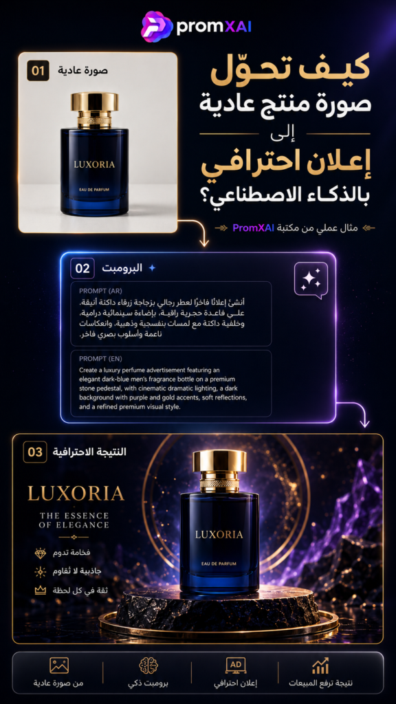
قد يكون لديك منتج ممتاز، لكن صورته العادية لا تُظهر قيمته الحقيقية. يظهر المنتج بوضوح، وتبدو العبوة سليمة، ومع ذلك لا تشعر أن الصورة تصلح لإعلان يجذب الانتباه أو يمنح العميل سببًا للتوقف.
المشكلة هنا ليست في المنتج، بل في الطريقة التي قُدِّم بها.
الإعلان الاحترافي لا يغيّر المنتج ولا يخدع العميل، وإنما يضعه داخل مشهد بصري يساعد على إبراز قيمته وهويته واستخدامه. فالمنتج نفسه قد يبدو عاديًا عندما يُصوَّر على طاولة بسيطة، ثم يبدو أكثر فخامة واحترافية عندما يوضع داخل تكوين مدروس بإضاءة مناسبة وخلفية تخدمه.
في هذا المقال سنتعلم كيف ننتقل من صورة منتج بسيطة إلى إعلان بصري احترافي باستخدام الذكاء الاصطناعي، بداية من فهم المنتج واختيار الفكرة، وصولًا إلى كتابة البرومبت ومراجعة النتيجة النهائية.
لماذا لا تكفي صورة المنتج العادية؟
صورة المنتج العادية تؤدي وظيفة مهمة، وهي تعريف العميل بشكل المنتج. لكنها غالبًا لا تؤدي الوظيفة التسويقية الكاملة.
قد تكون الصورة واضحة، لكنها لا تجيب عن أسئلة مثل:
- ما الإحساس الذي يمثله المنتج؟
- ما الفئة التي يستهدفها؟
- هل هو منتج فاخر أم عملي أم اقتصادي؟
- ما الميزة التي يجب أن يلاحظها العميل أولًا؟
- لماذا يختار العميل هذا المنتج بدلًا من منتج آخر؟
الإعلان الاحترافي يضيف إلى صورة المنتج قصة بصرية قصيرة. فهو لا يعرض العبوة فقط، بل يبني حولها جوًا مناسبًا يساعد العميل على فهم قيمتها.
في مثالنا، استخدمنا زجاجة عطر زرقاء داكنة بغطاء ذهبي. الصورة الأصلية تُظهر شكل العطر بوضوح، لكن الإعلان النهائي أضاف إليه منصة رخامية، وحلقات ذهبية، وإضاءة بنفسجية، وانعكاسات داكنة، فأصبح المشهد يوحي بالفخامة والتميز.
الخطوة الأولى: افهم المنتج قبل كتابة البرومبت
أكثر الأخطاء شيوعًا هو البدء في وصف خلفية جميلة قبل فهم المنتج نفسه.
قبل أن تكتب أي برومبت، اسأل:
- ما نوع المنتج؟
- من العميل المستهدف؟
- ما أهم ميزة في المنتج؟
- ما الإحساس الذي نريد أن يصل إلى المشاهد؟
- أين سيُنشر الإعلان؟
- ما الألوان المرتبطة بهوية العلامة التجارية؟
العطر الفاخر يحتاج إلى مشهد يختلف عن منتج تنظيف، ومنتج الأطفال يحتاج إلى ألوان وتكوين يختلفان عن منتج رجالي داكن.
في مثال العطر، كان الاتجاه المطلوب هو:
إعلان فاخر وداكن يوحي بالأناقة والغموض والقيمة العالية.
هذه الجملة البسيطة أصبحت الأساس الذي بُني عليه التصميم كاملًا.
الخطوة الثانية: اختر فكرة إعلانية واحدة
لا تحاول وضع جميع الأفكار داخل تصميم واحد.
قد تكون فكرة الإعلان:
- الكشف عن منتج جديد.
- إبراز ميزة أساسية.
- عرض المنتج داخل بيئته الطبيعية.
- مقارنة قبل وبعد.
- تقديم المنتج بأسلوب فاخر.
- إظهار طريقة الاستخدام.
- تحويل المنتج إلى بطل مشهد سينمائي.
في هذا المثال اخترنا فكرة واضحة:
وضع زجاجة العطر في منتصف مشهد فاخر، فوق منصة رخامية سوداء، مع هالة ذهبية وإضاءة بنفسجية تبرز لون العبوة.
كل عنصر داخل التصميم يجب أن يخدم هذه الفكرة. إذا لم يخدمها، فمن الأفضل حذفه.
الخطوة الثالثة: ابنِ المشهد حول المنتج
المنتج هو العنصر الرئيسي، والخلفية دورها مساعدته لا منافسته.
عند بناء المشهد حدد بوضوح:
- مكان المنتج.
- زاوية ظهوره.
- نوع القاعدة.
- العناصر الموجودة خلفه.
- المسافة بينه وبين الكاميرا.
- مستوى الانعكاس.
- اتجاه الإضاءة.
- المساحات الفارغة حوله.
في إعلان العطر تم وضع العبوة في منتصف التكوين، فوق قاعدة دائرية من الرخام الأسود بعروق ذهبية، مع حلقتين ذهبيتين في الخلف.
هذا التكوين جعل العين تنتقل مباشرة إلى العطر، بينما بقيت العناصر الأخرى إطارًا بصريًا يدعمه.
الخطوة الرابعة: صف الإضاءة بدقة
كلمة «إضاءة احترافية» وحدها لا تكفي، لأنها لا تحدد كيف يجب أن تبدو النتيجة.
الأفضل أن تصف:
- اتجاه الضوء.
- درجة لونه.
- قوته.
- الظلال الناتجة عنه.
- انعكاسه على العبوة.
- الضوء الخلفي.
- التوهج المحيط بالمنتج.
مثلًا:
إضاءة سينمائية جانبية ذهبية، مع ضوء خلفي بنفسجي يحدد حواف العبوة، وانعكاس ناعم فوق السطح، وظلال واقعية أسفل المنتج.
هذا الوصف يساعد أداة الذكاء الاصطناعي على فهم شكل المشهد بدل ترك جميع القرارات لها.
الإضاءة الجيدة يجب أن تؤدي ثلاث وظائف:
- إظهار حجم المنتج وخامته.
- فصله عن الخلفية.
- توجيه نظر المشاهد إليه.
الخطوة الخامسة: حافظ على شكل المنتج وهويته
هذه أهم خطوة في إعلانات المنتجات.
عند استخدام صورة مرجعية، يجب أن توضح أن المطلوب الحفاظ على:
- شكل العبوة.
- النسب والأبعاد.
- الغطاء.
- الألوان.
- الخامة.
- الشعار.
- النصوص.
- الأرقام.
- الرموز.
- مواضع العناصر المطبوعة.
لكن يجب أن نكون واقعيين: أدوات توليد الصور قد تخطئ في الكتابة والشعارات والتفاصيل الدقيقة، مهما كان البرومبت قويًا.
لذلك توجد طريقتان للتنفيذ:
الطريقة الأولى: التوليد المباشر
نستخدم صورة المنتج مرجعًا ونطلب الحفاظ عليها داخل المشهد.
هذه الطريقة مناسبة للتجارب السريعة أو عندما لا تحتوي العبوة على نصوص معقدة.
الطريقة الثانية: التركيب الاحترافي
نولد المشهد والخلفية، ثم نضع صورة المنتج الأصلية داخل التصميم باستخدام Photoshop أو أي أداة تحرير مناسبة.
هذه الطريقة أكثر أمانًا في الإعلانات التجارية؛ لأنها تحافظ على المنتج الحقيقي وتمنع تحريف الشعار أو النصوص.
الخطوة السادسة: اختر المقاس قبل التوليد
مقاس التصميم يؤثر في مكان المنتج وتوزيع العناصر والمساحات الفارغة.
أشهر المقاسات:
- 9:16: للقصص وReels وTikTok وShorts.
- 4:5: لمنشورات Instagram والإعلانات العمودية.
- 1:1: للمنشورات المربعة والمتاجر.
- 16:9: للفيديوهات والشاشات والعروض التقديمية.
في هذا المثال استخدمنا نسبة 9:16، لأنها مناسبة للعرض العمودي ولصفحات PromXAI.
لا أنصح بتوليد تصميم مربع ثم محاولة قصه إلى 9:16 لاحقًا؛ لأن المنتج قد يصبح كبيرًا جدًا أو تُفقد أجزاء مهمة من المشهد.
الخطوة السابعة: راجع النتيجة قبل استخدامها
قد تكون الصورة جميلة، لكنها غير صالحة كإعلان حقيقي.
راجع النتيجة نقطة بنقطة:
- هل شكل المنتج مطابق؟
- هل الغطاء صحيح؟
- هل الشعار واضح؟
- هل النصوص سليمة؟
- هل الظل متصل بالمنتج؟
- هل الانعكاس منطقي؟
- هل الخلفية تخدم المنتج؟
- هل يوجد عنصر مشوه؟
- هل الألوان متناسقة؟
- هل التصميم واضح على الهاتف؟
- هل توجد مساحة مناسبة للعناوين؟
أحيانًا يبدو التصميم ممتازًا من النظرة الأولى، لكن عند التدقيق تظهر كتابة غير صحيحة أو انعكاس غير منطقي أو اختلاف في شكل العبوة.
المراجعة ليست خطوة إضافية؛ هي جزء أساسي من عملية التصميم.
الفرق بين البرومبت الضعيف والبرومبت الاحترافي
برومبت ضعيف قد يكون مثل:
ضع العطر في خلفية جميلة مع إضاءة فخمة.
هذه الجملة لا تحدد التكوين أو الخلفية أو زاوية التصوير أو نوع الإضاءة، ولذلك ستنتج الأداة صورة عشوائية.
أما البرومبت الاحترافي فيحدد:
- نوع المنتج.
- موقعه.
- شكل القاعدة.
- الخلفية.
- الإضاءة.
- الانعاسات.
- الألوان.
- زاوية التصوير.
- أسلوب الصورة.
- نسبة العرض إلى الارتفاع.
- شروط الحفاظ على المنتج.
كلما كانت التعليمات منظمة، أصبحت النتيجة أقرب إلى الفكرة الموجودة في ذهنك.
أخطاء شائعة يجب تجنبها
ازدحام المشهد
إضافة الدخان والماء والورود والشرارات والأقمشة في تصميم واحد قد تجعل المنتج يختفي بين المؤثرات.
استخدام خلفية لا تناسب المنتج
ليست كل خلفية جميلة مناسبة لكل منتج. يجب أن تعكس الخلفية هوية المنتج والجمهور المستهدف.
إعادة توليد المنتج بالكامل
قد تنشئ الأداة عبوة شبيهة، لكنها ليست العبوة الأصلية. هذا غير مناسب عند إعداد إعلان تجاري حقيقي.
تجاهل مكان النصوص
يجب ترك مساحة مناسبة لإضافة السعر أو الميزة أو العبارة التسويقية دون تغطية المنتج.
الاعتماد على أول نتيجة
النتيجة الأولى ليست دائمًا الأفضل. أنشئ أكثر من نسخة، ثم اختر الأقرب للفكرة.
المبالغة في المؤثرات
الإعلان الاحترافي لا يعني إضافة أكبر عدد ممكن من التأثيرات. أحيانًا يكون المشهد البسيط أكثر فخامة.
سير العمل الذي ننصح به في PromXAI
للحصول على نتيجة عملية ومنظمة، اتبع هذا التسلسل:
- التقط صورة واضحة للمنتج.
- تأكد من وضوح الشعار والكتابة.
- حدد الجمهور والهدف.
- اختر فكرة الإعلان.
- حدد المقاس.
- اكتب البرومبت.
- أنشئ أكثر من نتيجة.
- اختر أفضل مشهد.
- ركّب المنتج الأصلي عند الحاجة.
- أضف النصوص التسويقية.
- راجع الأخطاء.
- صدّر التصميم بالمقاس المناسب.
هذا الأسلوب يجمع بين سرعة الذكاء الاصطناعي ودقة المصمم.
هل الذكاء الاصطناعي يغني عن المصمم؟
الذكاء الاصطناعي يختصر الوقت ويساعد على اختبار الأفكار، لكنه لا يقرر بدلًا عنك.
أنت من يحدد:
- الفكرة.
- الرسالة.
- الجمهور.
- النتيجة المناسبة.
- مدى مطابقة المنتج.
- صلاحية التصميم للاستخدام التجاري.
أفضل النتائج لا تأتي من أداة قوية فقط، بل من مستخدم يعرف ماذا يريد وكيف يصفه.
شاهد البرومبت المستخدم
صورة هذا المقال لم تُنشأ عشوائيًا، بل بُنيت باستخدام برومبت منظم يحدد المنتج والمشهد والإضاءة والتكوين والنسبة.
يمكنك الضغط على زر:
عرض البرومبت المستخدم
للانتقال إلى صفحة البرومبت، وقراءة النسخة العربية والإنجليزية، ثم نسخها أو تعديلها لتناسب منتجك.
الخلاصة
تحويل صورة منتج عادية إلى إعلان احترافي لا يعني تغيير المنتج أو إضافة خلفية جميلة فقط.
العملية تبدأ بفهم المنتج والجمهور، ثم اختيار فكرة واحدة واضحة، وبناء مشهد مناسب، وكتابة برومبت منظم، والمحافظة على شكل العبوة، وأخيرًا مراجعة النتيجة بدقة.
الذكاء الاصطناعي يمنحك سرعة كبيرة في توليد الأفكار والمشاهد، لكن الجودة النهائية تعتمد على وضوح رؤيتك ودقة تعليماتك.
عندما تجتمع الفكرة الصحيحة مع البرومبت الجيد والتنفيذ الدقيق، تتحول الصورة البسيطة إلى إعلان يصنع حضورًا حقيقيًا لمنتجك.
You may have an excellent product, yet its ordinary photo fails to communicate its true value. The product is clearly visible, the packaging looks intact, and still the image does not feel suitable for an advertisement that captures attention or gives customers a reason to stop scrolling.
The problem is not always the product itself. It is often the way the product is presented.
A professional advertisement does not change the product or mislead the customer. Instead, it places the product inside a visual scene that highlights its value, identity, and purpose. The same product may look ordinary when photographed on a simple table, then appear far more premium when presented in a carefully planned composition with suitable lighting and a background that supports it.
In this article, you will learn how to move from a simple product photo to a professional visual advertisement using artificial intelligence, starting with understanding the product and choosing the concept, then writing the prompt and reviewing the final result.
Why Is an Ordinary Product Photo Not Enough?
A basic product photo performs an important function: it shows the customer what the product looks like. However, it often does not fulfill the complete marketing purpose.
The image may be clear, but it does not answer questions such as:
- What feeling does the product represent?
- Who is the target audience?
- Is the product luxurious, practical, or affordable?
- What feature should the customer notice first?
- Why should the customer choose this product over another?
A professional advertisement adds a short visual story around the product. It does not merely display the packaging; it creates an atmosphere that helps the customer understand its value.
In our example, we used a dark-blue perfume bottle with a gold cap. The original photo clearly shows the perfume bottle, while the final advertisement adds a black marble pedestal, golden rings, purple lighting, and dark reflections. These elements make the scene feel more luxurious and distinctive.
Step One: Understand the Product Before Writing the Prompt
One of the most common mistakes is to begin describing a beautiful background before understanding the product itself.
Before writing any prompt, ask:
- What type of product is it?
- Who is the target customer?
- What is the product’s most important feature?
- What feeling should the viewer experience?
- Where will the advertisement be published?
- Which colors are associated with the brand identity?
A luxury perfume needs a different scene from a cleaning product, and a children’s product needs different colors and composition from a dark masculine product.
For the perfume example, the desired direction was:
> A luxurious, dark advertisement that communicates elegance, mystery, and high value.
This simple sentence became the foundation for the entire design.
Step Two: Choose One Advertising Concept
Do not try to place every possible idea inside one design.
The advertising concept may be:
- Revealing a new product.
- Highlighting one key feature.
- Showing the product in its natural environment.
- Presenting a before-and-after comparison.
- Displaying the product in a luxurious style.
- Demonstrating how the product is used.
- Turning the product into the hero of a cinematic scene.
For this example, we selected a clear concept:
> Place the perfume bottle at the center of a premium scene, on a black marble pedestal, with a golden halo and purple lighting that enhances the bottle’s color.
Every element in the design should support this concept. Anything that does not support it should be removed.
Step Three: Build the Scene Around the Product
The product is the main subject. The background should support it, not compete with it.
When building the scene, clearly define:
- The product’s position.
- The viewing angle.
- The type of display pedestal.
- The elements placed behind it.
- The distance between the product and the camera.
- The level of reflection.
- The lighting direction.
- The empty space around the product.
In the perfume advertisement, the bottle was placed in the center of the composition on a circular black marble pedestal with gold veining, while two golden rings were positioned behind it.
This composition directs the viewer’s attention immediately toward the perfume, while the surrounding elements act as a visual frame.
Step Four: Describe the Lighting Precisely
The phrase “professional lighting” is not enough because it does not explain what the final lighting should look like.
A stronger description identifies:
- The direction of the light.
- Its color temperature.
- Its intensity.
- The shadows it creates.
- Its reflection on the bottle.
- The backlight.
- The glow surrounding the product.
For example:
> Cinematic golden side lighting, with a purple backlight defining the edges of the bottle, a soft reflection on the surface, and realistic shadows beneath the product.
This description helps the AI tool understand the intended scene instead of leaving every decision to the model.
Good lighting should perform three functions:
- Reveal the product’s volume and material.
- Separate the product from the background.
- Guide the viewer’s attention toward it.
Step Five: Preserve the Product’s Shape and Identity
This is the most important step in product advertising.
When using a reference image, clearly state that the following details must be preserved:
- The outer shape.
- The proportions and dimensions.
- The cap.
- The colors.
- The materials.
- The logo.
- The printed text.
- The numbers.
- The symbols.
- The placement of printed elements.
However, it is important to be realistic: AI image-generation tools may still make mistakes in text, logos, and fine details, even when the prompt is strong.
There are two main production methods.
Method One: Direct Generation
Use the product image as a reference and ask the tool to preserve it inside the new scene.
This method works well for quick experiments or for products without complex labels.
Method Two: Professional Compositing
Generate the background and surrounding scene, then place the original product photo into the design using Photoshop or another suitable editing tool.
This method is safer for real commercial advertising because it preserves the authentic product and prevents distortion of the logo or printed text.
Step Six: Choose the Format Before Generating
The image format affects the product’s placement, the distribution of visual elements, and the amount of empty space.
Common aspect ratios include:
- 9:16: Stories, Reels, TikTok, and Shorts.
- 4:5: Instagram posts and vertical advertisements.
- 1:1: Square posts and online stores.
- 16:9: Videos, screens, and presentations.
For this example, we used a 9:16 aspect ratio because it works well for vertical display and PromXAI pages.
It is not recommended to generate a square design and crop it into 9:16 later. The product may become too large, or important parts of the scene may be lost.
Step Seven: Review the Result Before Using It
An image may look attractive while still being unsuitable for a real advertisement.
Review the result carefully:
- Is the product shape accurate?
- Is the cap correct?
- Is the logo clear?
- Is the printed text accurate?
- Is the shadow connected naturally to the product?
- Is the reflection realistic?
- Does the background support the product?
- Are there any distorted elements?
- Are the colors harmonious?
- Is the design clear on a mobile screen?
- Is there enough space for marketing text?
Sometimes a design looks excellent at first glance, but closer inspection reveals incorrect text, unrealistic reflections, or changes to the packaging.
Reviewing is not an optional extra step. It is an essential part of the design process.
The Difference Between a Weak Prompt and a Professional Prompt
A weak prompt may say:
> Place the perfume in a beautiful background with luxurious lighting.
This sentence does not define the composition, background, camera angle, or lighting style. As a result, the tool is likely to generate an unpredictable image.
A professional prompt defines:
- The type of product.
- Its position.
- The display pedestal.
- The background.
- The lighting.
- The reflections.
- The colors.
- The camera angle.
- The visual style.
- The aspect ratio.
- The product-preservation requirements.
The more organized the instructions are, the closer the result will be to the idea in your mind.
Common Mistakes to Avoid
Overcrowding the Scene
Adding smoke, water, flowers, sparks, and fabric to one composition may cause the product to disappear among the effects.
Choosing a Background That Does Not Suit the Product
Not every beautiful background is suitable for every product. The background should reflect the product identity and the intended audience.
Regenerating the Entire Product
The AI may create a similar bottle, but it will not necessarily be the original product. This is unsuitable for real commercial advertising.
Ignoring Space for Text
Leave enough room for the price, product feature, or marketing message without covering the product.
Using the First Result
The first result is not always the best. Generate several versions, then choose the one closest to the intended concept.
Overusing Visual Effects
Professional advertising does not mean adding as many effects as possible. A simple scene can sometimes appear more luxurious.
The Workflow Recommended by PromXAI
For a practical and organized result, follow this sequence:
- Capture a clear product photo.
- Make sure the logo and text are visible.
- Define the audience and advertising objective.
- Choose the advertising concept.
- Select the aspect ratio.
- Write the prompt.
- Generate several results.
- Choose the strongest scene.
- Composite the original product when necessary.
- Add the marketing text.
- Review the image for errors.
- Export the design in the correct format.
This workflow combines the speed of artificial intelligence with the precision of professional design.
Does Artificial Intelligence Replace the Designer?
Artificial intelligence saves time and helps users test ideas, but it does not make creative decisions for you.
You are the person who defines:
- The concept.
- The message.
- The audience.
- The most suitable result.
- The accuracy of the product.
- The design’s readiness for commercial use.
The best results do not come from a powerful tool alone. They come from a user who knows what they want and how to describe it.
View the Prompt Used
The image in this article was not created randomly. It was built using a structured prompt that defines the product, scene, lighting, composition, and aspect ratio.
Click:
> View the Prompt Used
to open the prompt page, read the Arabic and English versions, and copy or adapt them for your own product.
Conclusion
Turning an ordinary product photo into a professional advertisement is not simply about changing the background or adding attractive effects.
The process begins with understanding the product and its audience, choosing one clear concept, building a suitable scene, writing a structured prompt, preserving the original packaging, and carefully reviewing the final result.
Artificial intelligence gives you tremendous speed when generating ideas and scenes, but the final quality still depends on the clarity of your vision and the precision of your instructions.
When the right idea, a strong prompt, and accurate execution come together, a simple product photo can become an advertisement that creates a powerful presence for your brand.